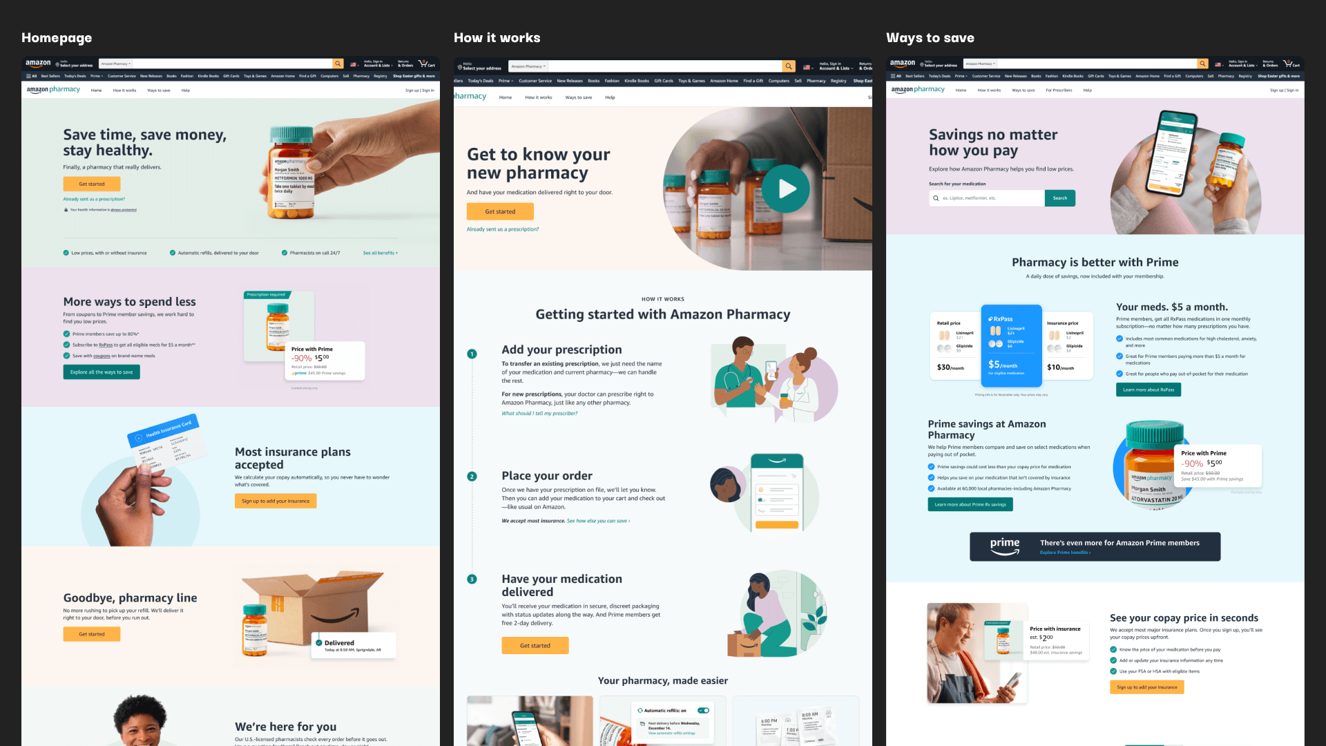
The first iteration of the Amazon Pharmacy storefront (customer facing landing pages) was launched in 2020 and was largely unchanged for three years. During that time, product improvements were made, and years of user and market research was gathered. In 2023, I was tasked with a complete overhaul of this first-touch experience.
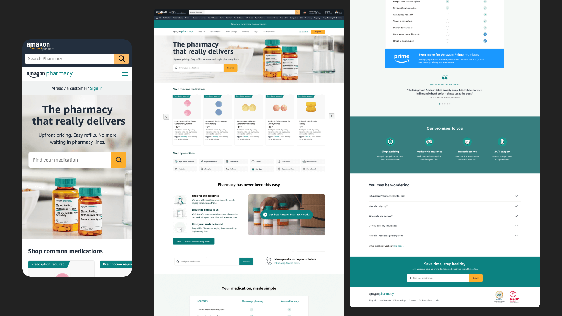
Before
A shopping-focused experience
The old version of the Amazon Pharmacy website was focused around the idea of making shopping for medication as easy as shopping for socks on Amazon. The primary CTA’s prompted customers to search for their medications— putting the burden of finding the right medication and dosage on the customer.
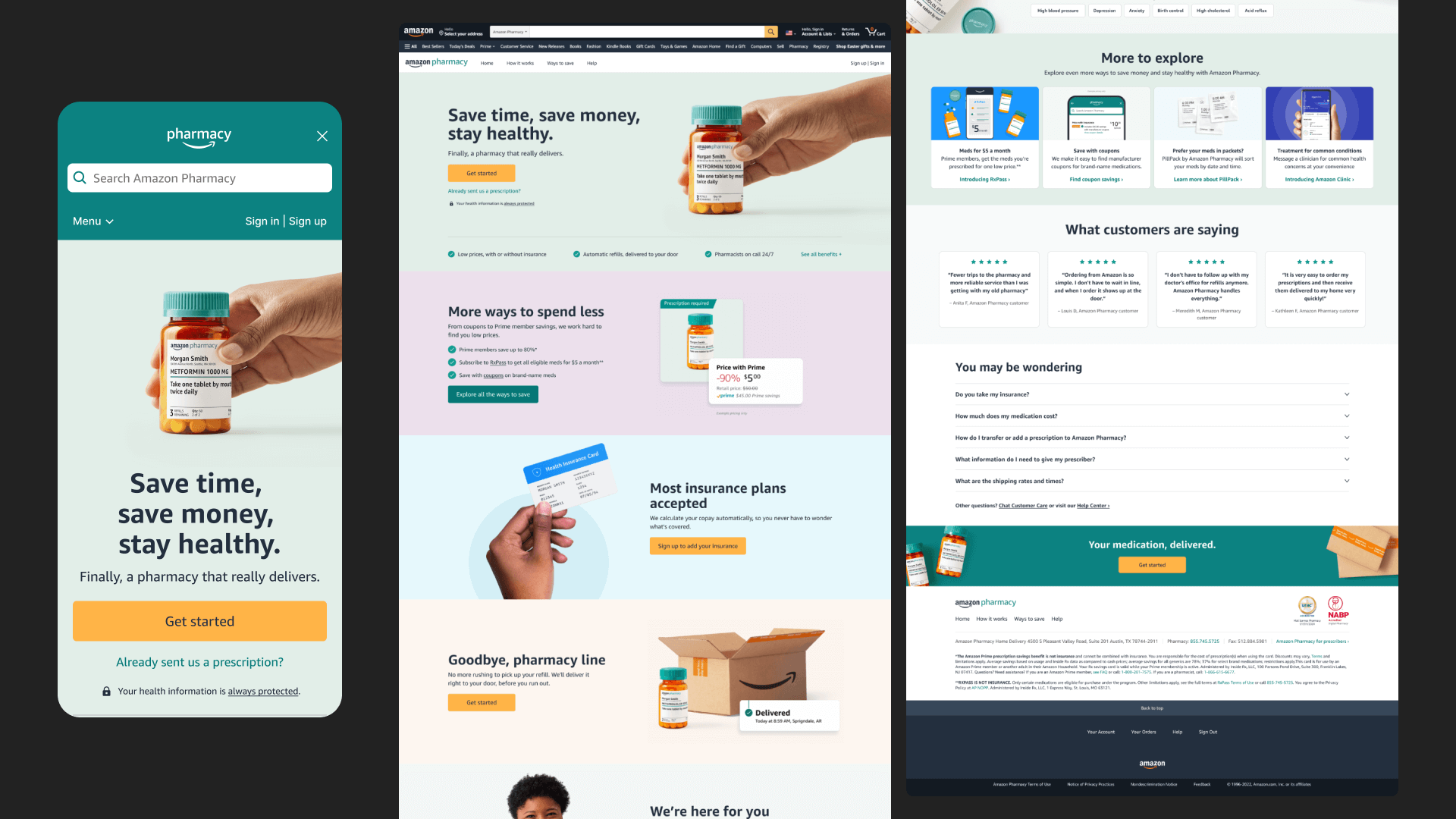
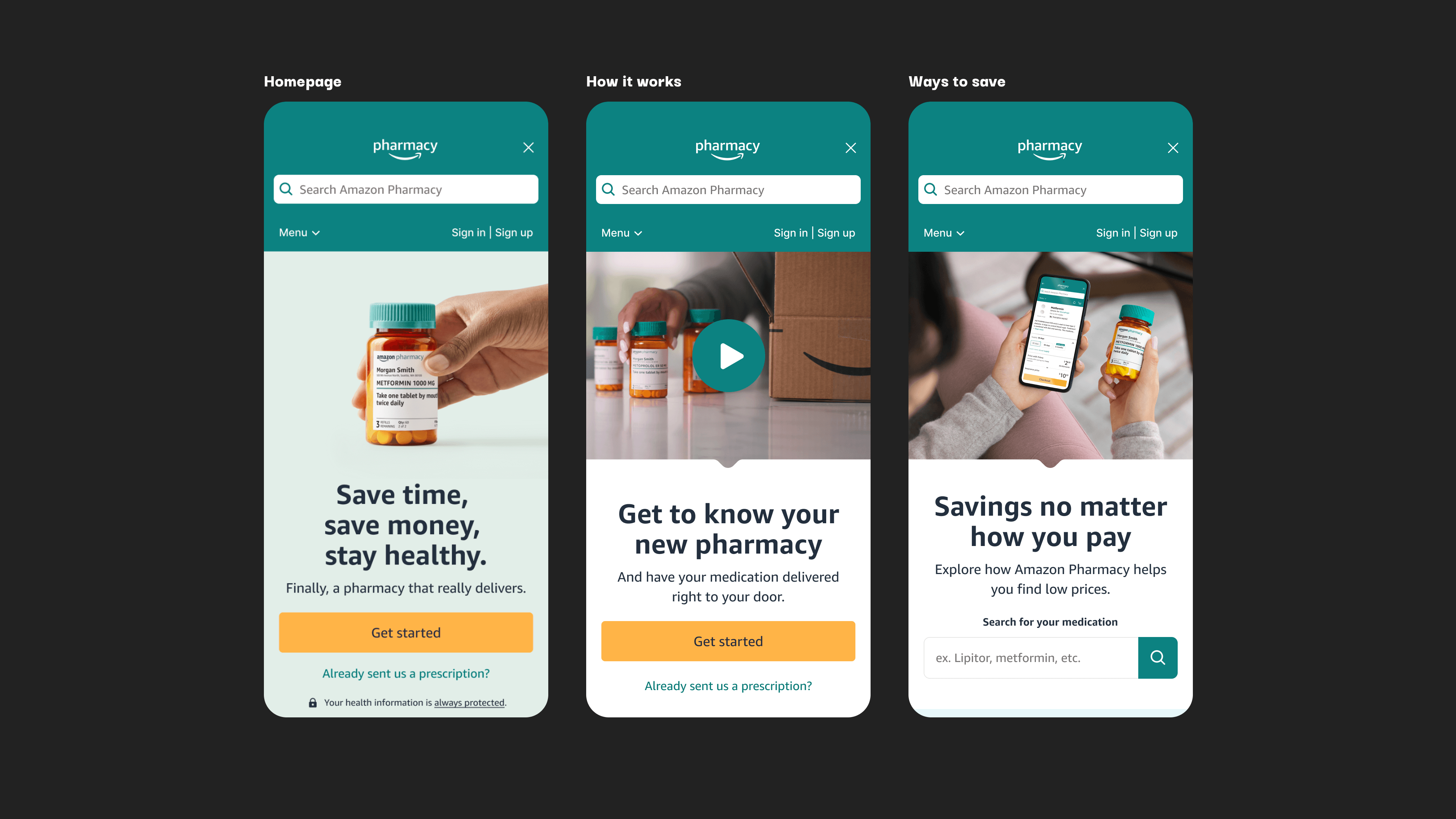
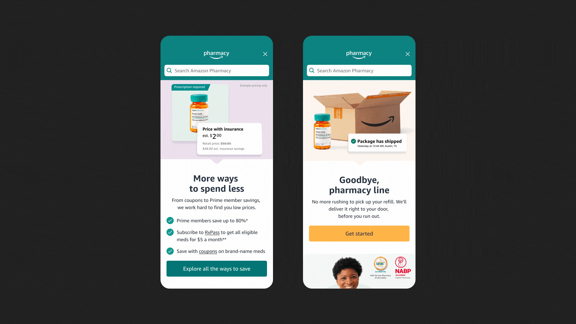
After
An educational experience
As the consumer-facing front door of Amazon Pharmacy, the website redesign aimed to help prospective customers better understand the benefits of Amazon Pharmacy (including introducing the idea of an online pharmacy), while focusing less on pushing customers to “shop” for their own prescription medications.
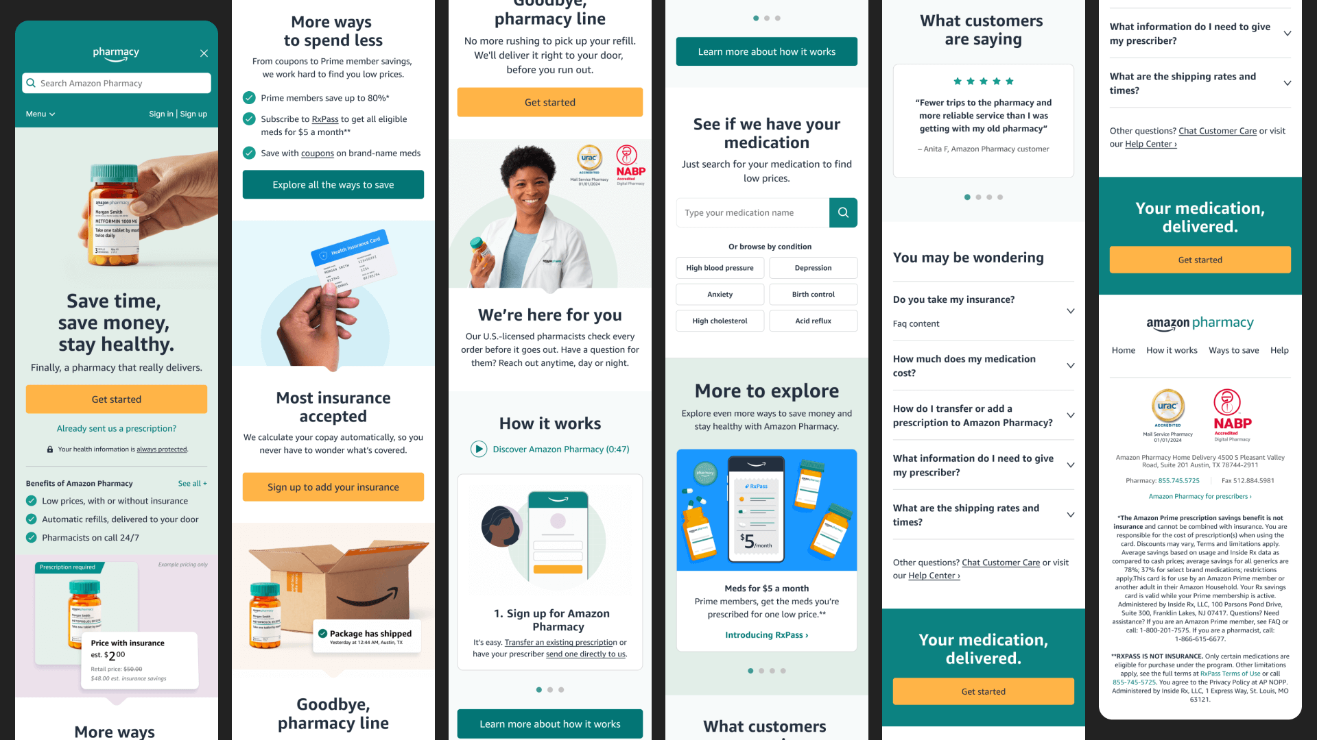
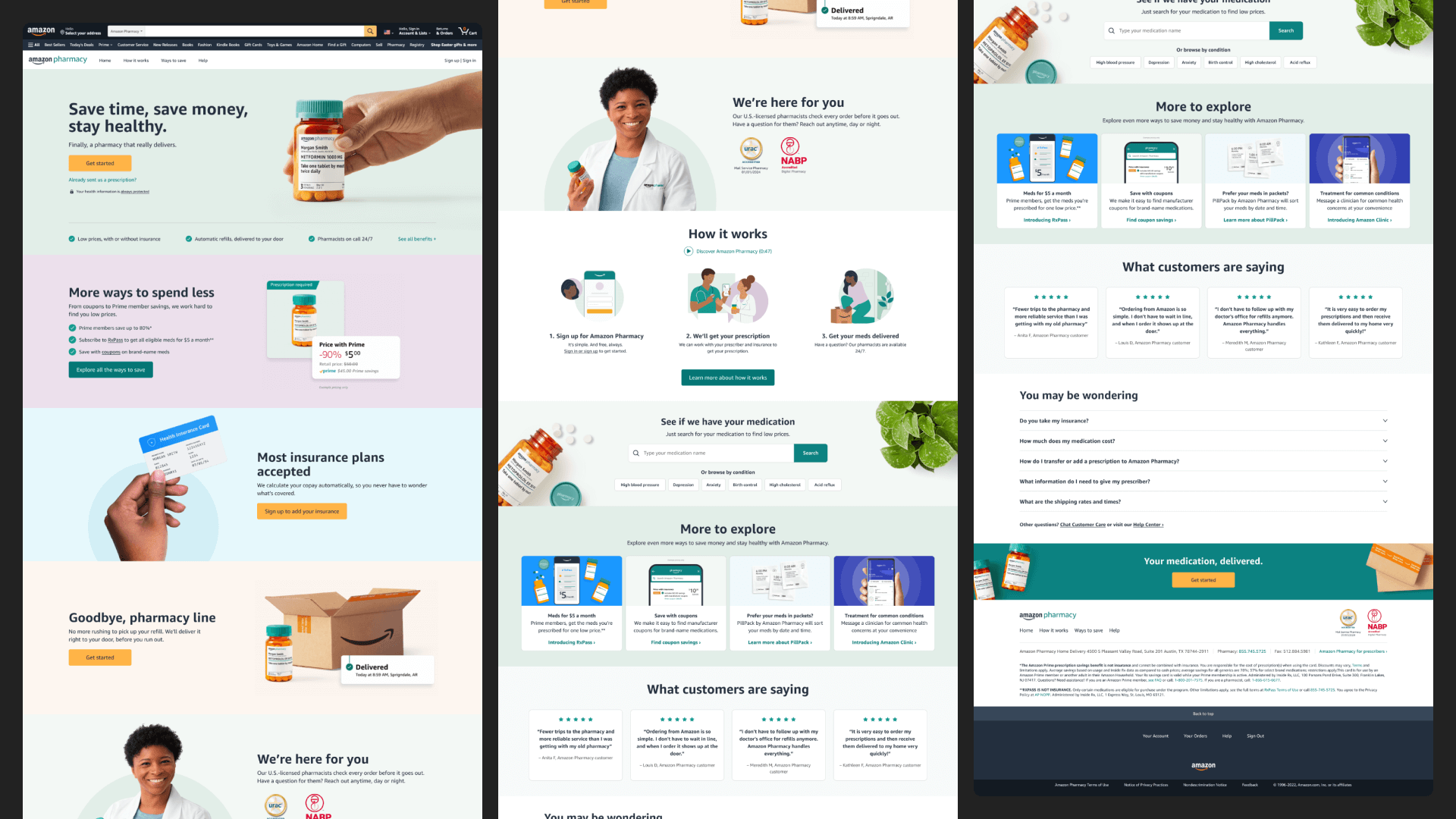
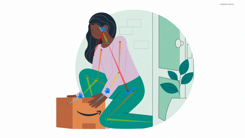
Delightful details
I incorporated motion and illustration where necessary in order to tell a story like delivery tracking or pricing options or to keep customers engaged with content like the “How it works” carousel.
Design system
A scalable, holistic solution
As part of this project, I established an updated design system for our customer-facing landing pages and made a corresponding Figma component library. This helped speed up future page creation and added a level of consistency across our landing pages.
I also strived to solve for not only our external customer needs, but also for our internal customers. An example of this was creating a dedicated program cross-promotion section and creating cross-promotion guidelines to ensure there were guardrails in place around what we featured on our storefront.
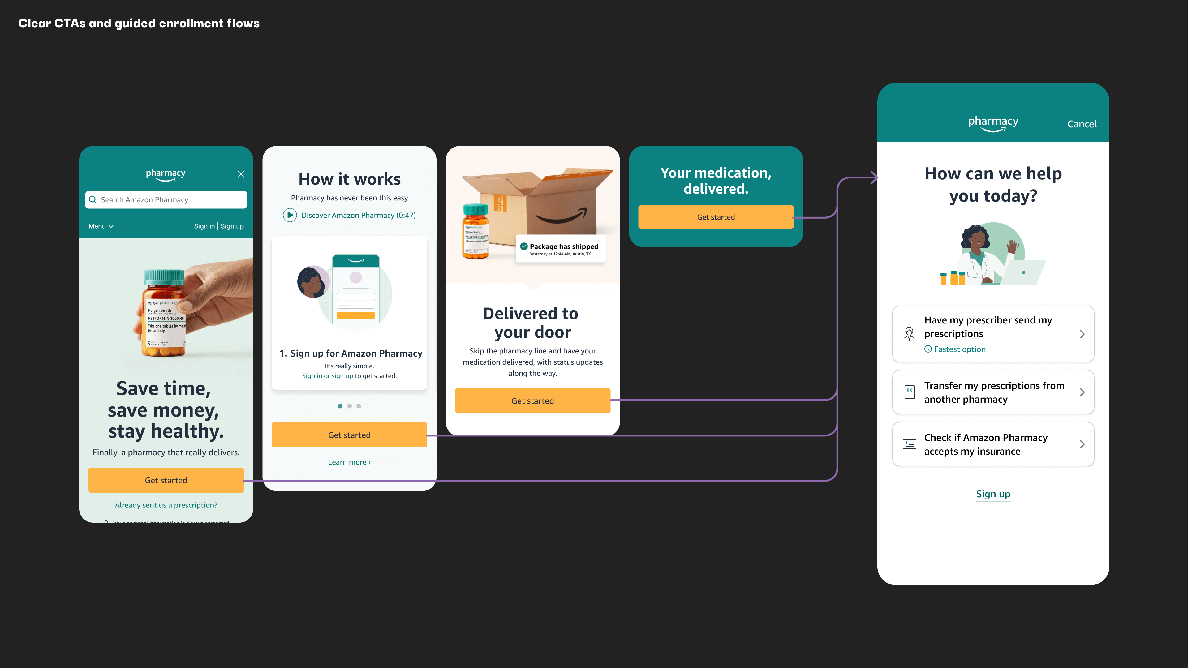
Enrollment 2.0
The first step in a ✨magical✨ onboarding experience
The storefront redesign was one of several UX workstreams which all went hand-in-hand. I worked especially close with the UX designer working on the revamped ✨magical✨ enrollment flow— which guided customers through specific flows based on their needs.
As part of the Enrollment 2.o workstream, I provided art direction and animation, collaborating with an ACD, Illustrator, and UX designer.
As I worked on the storefront, I imagined it as the first step in this guided onboarding process, with one of it’s primary goals being to encourage customers to ingress into one of the enrollment flows.
Process
Research x identify opportunity areas
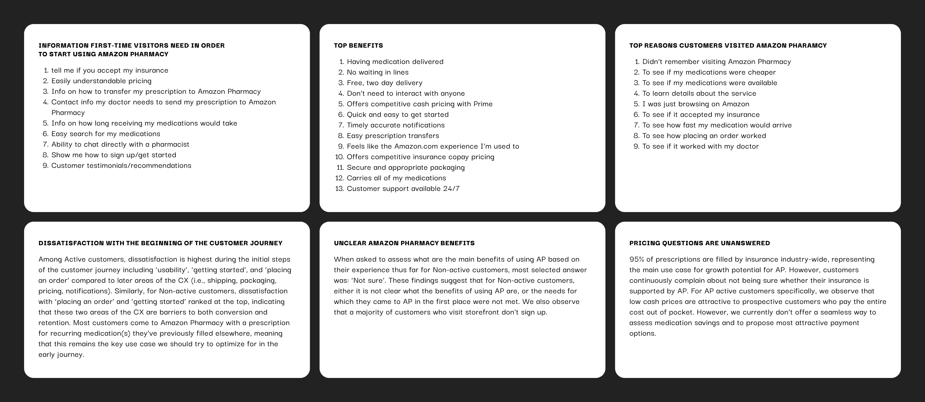
After collecting three years of user data and feedback, it became clear that customers do not prefer to “shop” for prescription medication in the same way as they do for socks.
I spent the early phases of this project poring over pages and pages of the research we had available, and identified customer needs and pain points with the current customer experience.
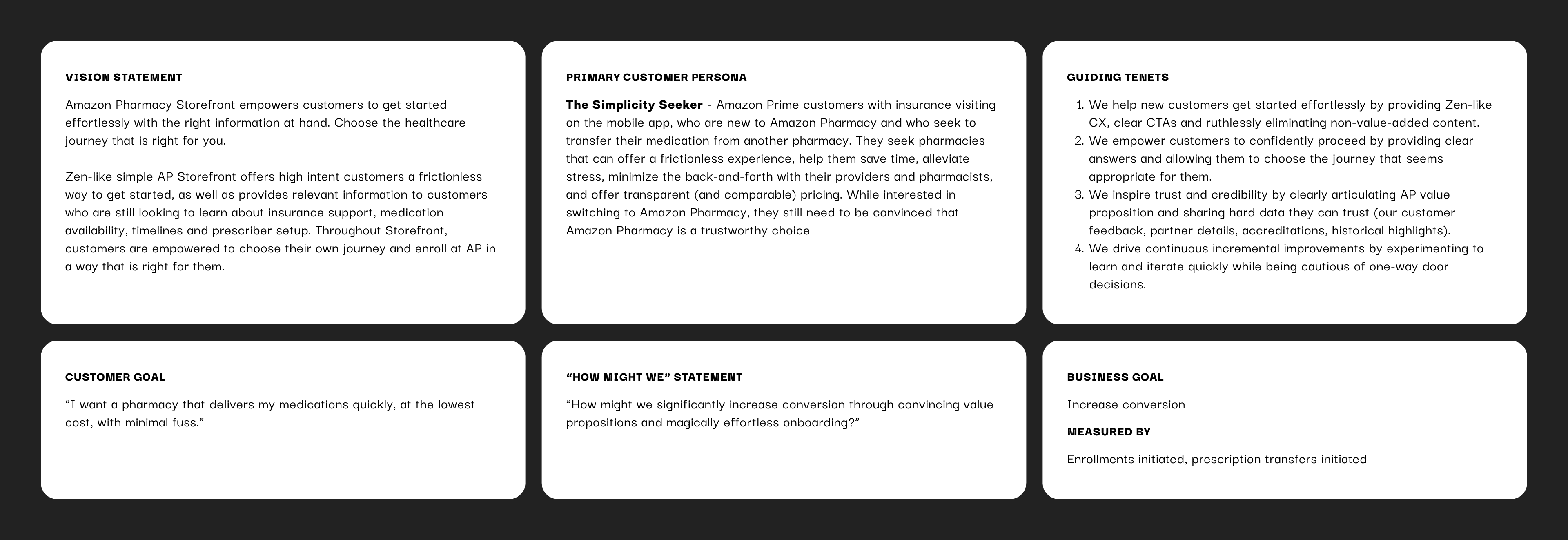
Brainstorm x define the focus
To kick off this project, key stakeholders from product, UX, and brand held a brainstorm via figjam and aligned on a vision statement, primary customer persona, guiding tenets, customer/business goals and more. These became essential to the North star vision of this project.
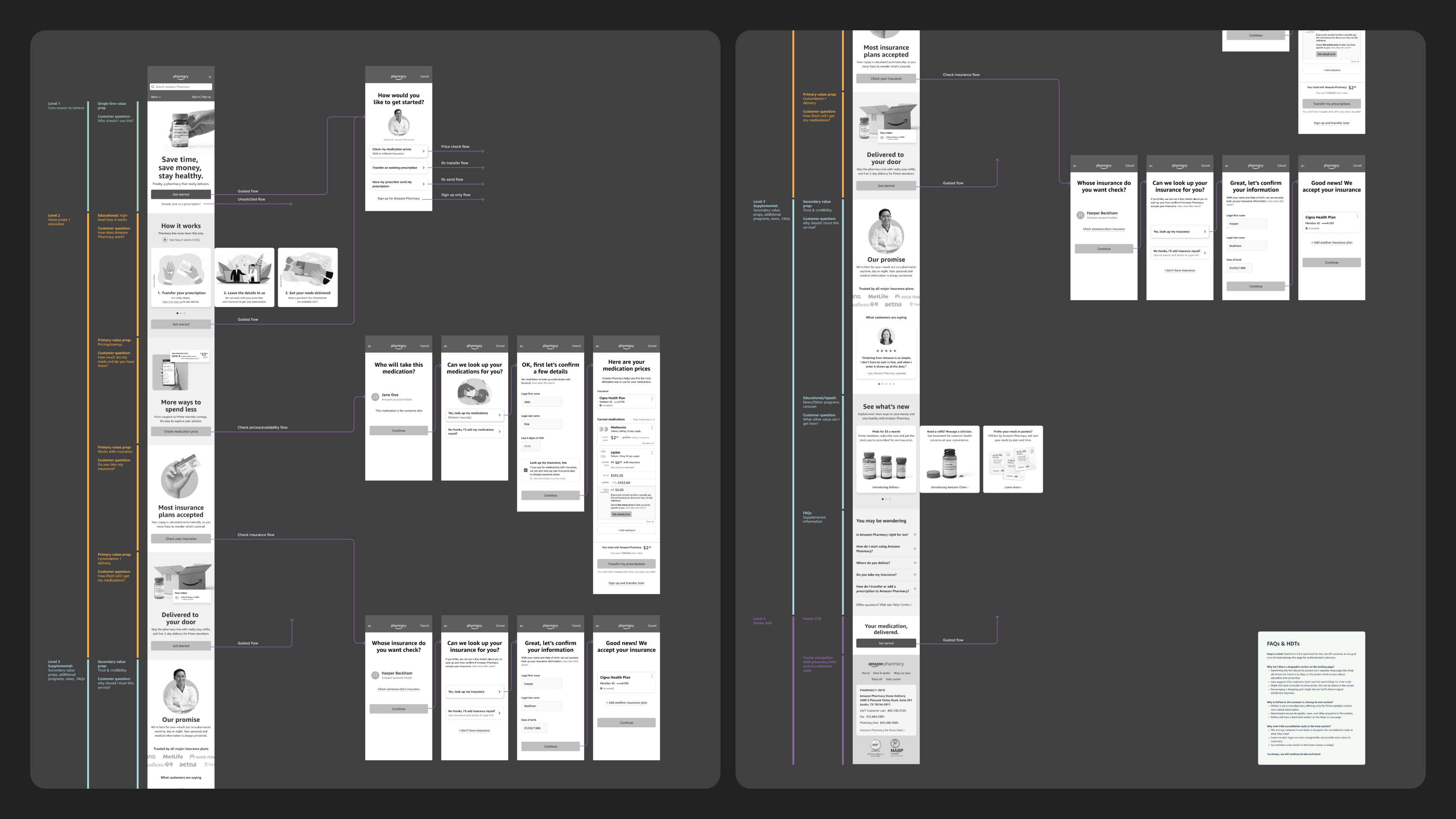
Information Architecture
Working backwards from the customer, with our research in mind, began to ideate on the information hierarchy, eventually landing on the following tiers:
Tier 1:
- Why should I use this?
Tier 2:
- Do you have the meds I want?
- How much does it cost?
- Do you take my insurance?
- How fast will I get it?
Tier 3:
- How does it work?
- What do I need to get started?
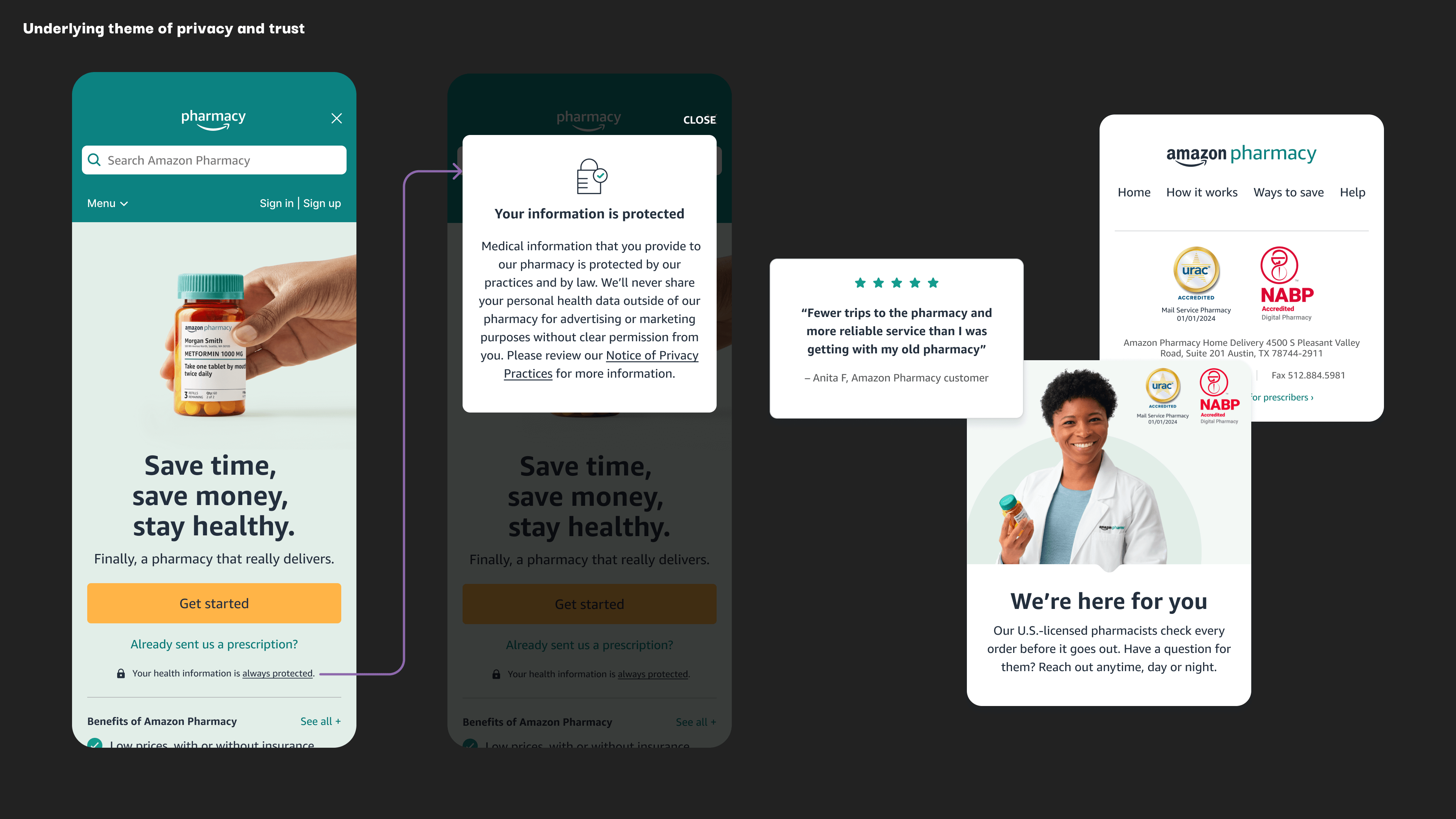
Underlying theme: Privacy + trust
Wireframing x Iteration
After getting alignment on the overall information hierarchy, I began to iterate on page layouts and content organization.
I also kept in mind technical constraints, one large one being a lack of engineering support— which meant these pages would need to be built using a limited set of widgets using an internal CMS similar to wordpress (but more limited).
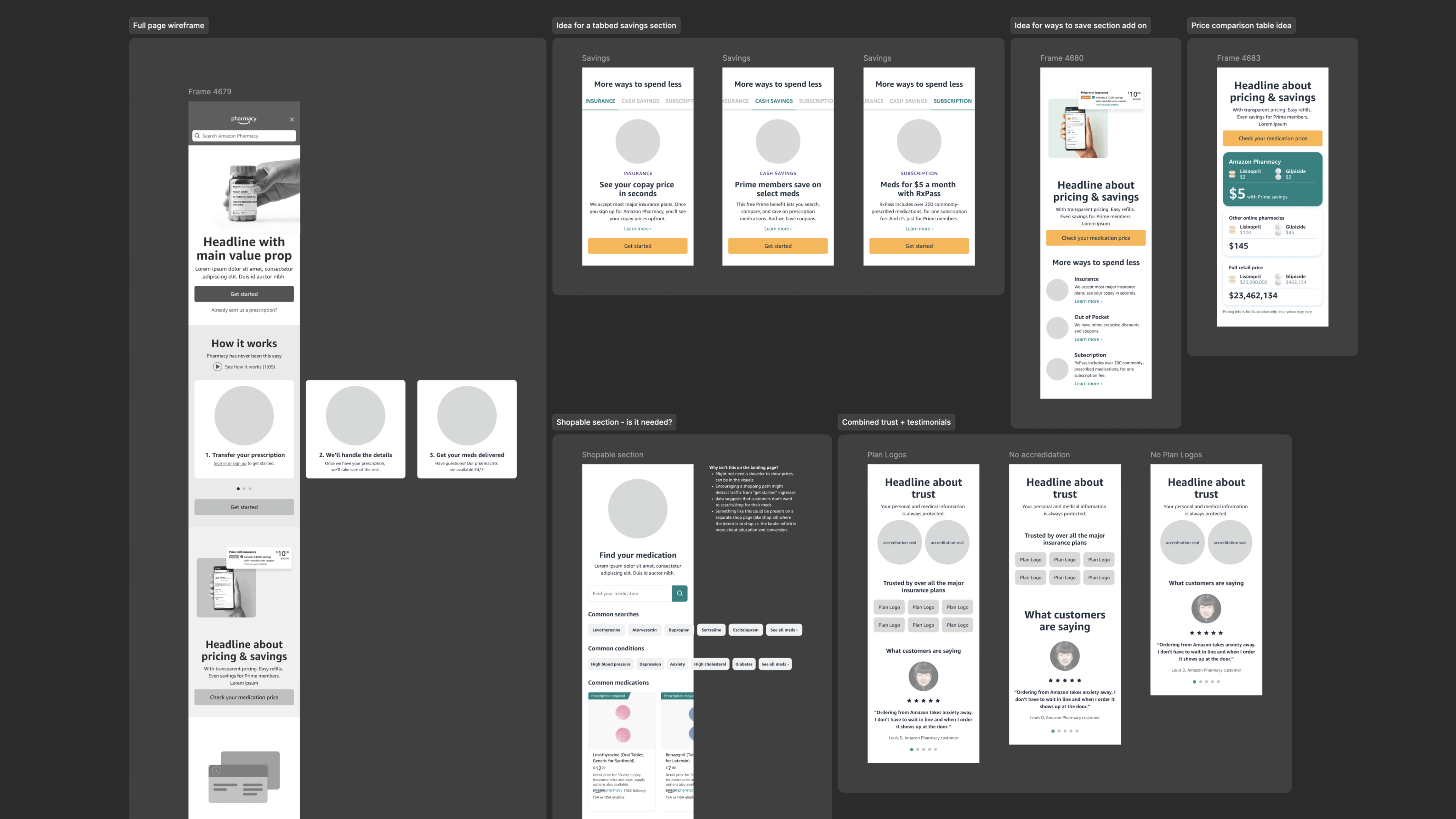
User testing x Focus groups
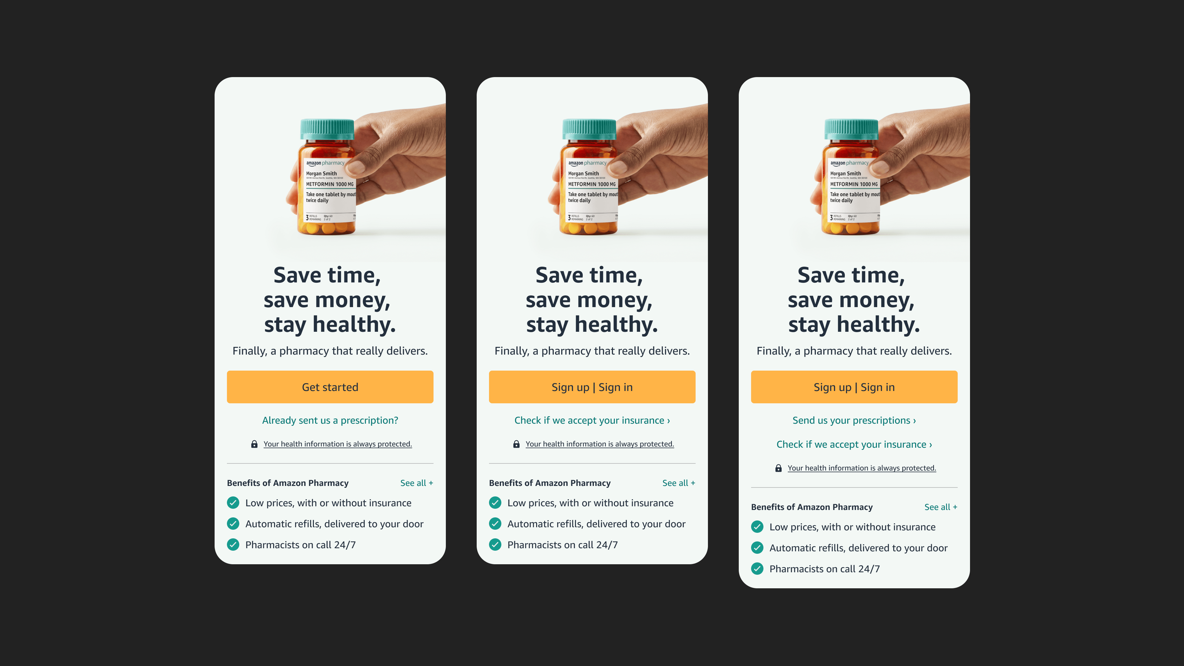
Once I had a solid wireframe, I worked with a market researcher and a copywriter to test value propositions, content ordering, messaging, and other areas of optimization. I made a prototype of both the old and new landing pages and they were tested against each other to see if our updates were having the desired effect.
High-fidelity mocks x asset production
After incorporating the learnings from user testing and the focus groups, I then needed to finalize the mocks and create all of the visual design assets, including photos, icons, illustrations, and animations. We worked with an illustrator for the primary three how it works illustrations, which I then refined and animated.
Page builds x QA
I was also responsible for building the pages themselves, using an internal CMS tool. Due to technical constraints, there was no engineering support for these landing pages, so I needed to use some creative workarounds to get these pages built using the existing tools at hand.

Launch x Ongoing updates
The new experience was tested against the legacy experience for 28 days— after seeing overwhelmingly positive results, the decision was made to launch the new experience, which was followed a few months later with the launch of the new “guided enrollment” experience.
Since launch, I have continued to experiment with iterative improvements and have made several updates.
Results
Educated customers = new customers
We decided to launch the refreshed Amazon Pharmacy homepage, how it works page, and savings page after a 28-day experiment in US on desktop and mobile, with 2 treatments (Control, Treatment 1). We met our primary launch criteria of improving Pharmacy signups over C in T1. This proved our hypothesis that updating our Storefront content to educate prospective customers with AP value props and how it works helps improve the likelihood for new customers to get started with AP.
Increase in profiles created, Rx received, and direct from prescriber customers
Overall, the page refresh resulted a significant increase in customers ingressing to the enrollment flow, which was one of the primary goals of the landing page. Shortly after launching the new landing pages, we rolled out the new enrollment flows which helped to eliminate dropoff after clicking “get started”.
Decrease in individual medication detail page views and medication search bar usage
There was minor decrease in medication detail page views and medication search bar usage, which was expected. Despite the decrease in these, it had no impact on chases initiated or order conversion, reinforcing our learning that customers did not necessarily prefer to shop for their own medications.